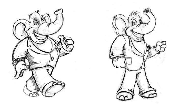
One of the funnest experiences we’ve had in recent time was the mascot design for Mr.Bucks. I mean, take a look at this guy. He’s got style, cool, pizzaz and cash dripping offa him. The client wanted to make sure that Mr.Bucks was anything but your average cartoon elephant. They key words in the creative brief were confident, confident and you guessed it, CONFIDENT.
Other traits we had to incorporate into the design were movement, perfection and confidence. Oh yeah, we already mentioned that three times already … but it was important. If you look at Mr.Bucks you’ll see he walks tall and assertively without being overbearing or too aggressive. He still comes across as someone you could approach but you realize that whatever you say better be interesting and to the point because this guy has work to do.
Working with the client we narrowed down a look and feel that we could use as a base and then with some tweaking, the final sketch was approved. From there, it was down to picking the colors which would work well to enforce the raw strength of this character.


